:quality(80))
Stop Building Someone Else's Dream Business
It's one of the biggest mistakes entrepreneurs make. We spend years chasing goals that we believe will make us happy, only to arrive and realise they don't.
:quality(80))
Discover the 7 biggest website friction points that cost you conversions—with practical fixes and a self‑audit checklist.
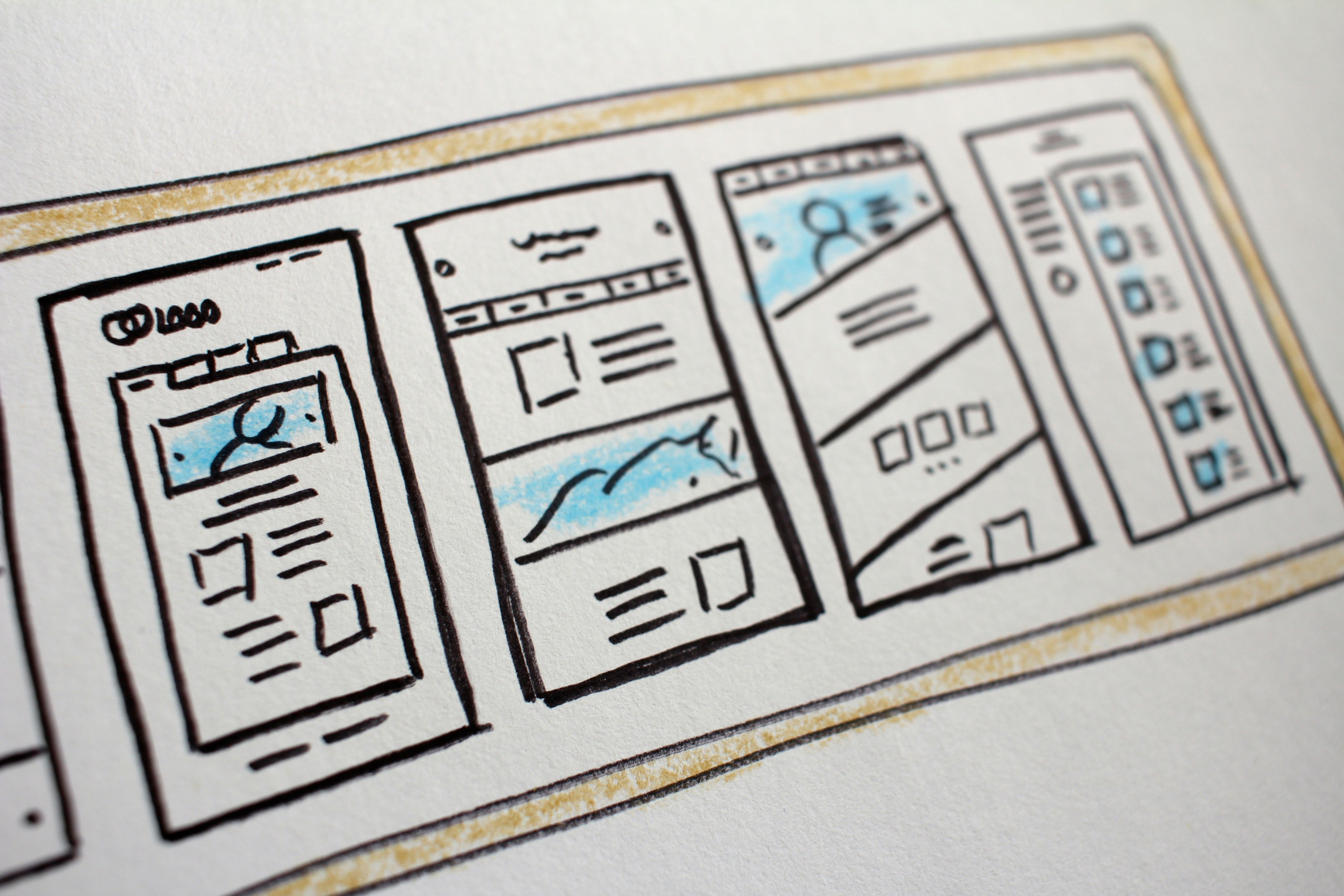
You don’t lose sales only to competitors—you lose them to friction. The moments of confusion, delay, or doubt that nudge visitors to bounce or postpone a purchase.
Below are seven high‑impact friction points, why they matter, common pitfalls, and practical fixes. At the end, you’ll find a simple self‑audit you can run on your own site.
Friction isn’t always obvious in analytics. It often lives in the tiny frustrations users encounter before they ever click “Buy.”
A slow or janky site quietly taxes every user action. Long load times, layout shifts, and delayed interactivity are conversion killers—especially on mobile and mid‑tier devices.
Why it matters: every extra second reduces the chance your visitor sees your value proposition, finds the right product, and completes checkout. Search engines and ad platforms also reward fast sites.
Common pitfalls include oversized images and videos, bloated JavaScript, render‑blocking resources, no CDN or caching strategy, and layout shifts from images or ads without defined dimensions.
To fix it, start with the heavy hitters: compress and resize images (WebP/AVIF), lazy‑load below the fold, split and defer JavaScript, inline critical CSS, and serve via a CDN.
Reserve space for media to prevent layout shifts, and prioritise LCP, CLS, and INP when triaging.
If visitors can’t find it, they can’t buy it. Poor information architecture forces users to guess, backtrack, or lean on site search for basics.
The symptoms are familiar: vague labels like “Solutions,” deep menu nesting that buries popular pages, and mismatches between navigation, headings, and URLs. You’ll see pogo‑sticking, odd search queries, and drop‑offs from category pages.
Clear labels that reflect customer language, a flatter structure that elevates top tasks, and consistent naming conventions go a long way.
Add a prominent, reliable search with autosuggest—then validate your structure with quick card‑sorting and tree‑testing before you ship changes.
A good rule: if a new visitor can’t reach your top money pages in two clicks, your UX is working against you.
The first screen must answer three questions instantly: what you sell, who it’s for, and why it’s better. If it doesn’t, users hesitate or leave.
Common pitfalls include vague taglines, generic imagery, and feature lists without outcomes. Rotating carousels often hide the most important message.
Write a crisp headline that spells out the product and primary benefit, a subhead with key differentiators, and a clear primary CTA.
Back it with immediate proof—review averages, customer logos, or a concrete metric.
Use specific imagery that shows the product in context or the interface in use.
Checkout should feel inevitable, not arduous. Hidden fees, forced account creation, and long forms create the opposite effect.
People abandon when costs jump at the last moment, fields error without explanation, or preferred payment methods aren’t supported. Mobile intensifies these issues.
Practical fixes:
Show total costs early with shipping/tax estimates on the cart page.
Offer guest checkout; let accounts be created post‑purchase with one click.
Reduce fields with address lookup and autofill; validate in real time with clear microcopy.
Support wallets like Apple Pay, Google Pay, and PayPal; persist carts across sessions.
Mobile traffic dominates, but typing is harder, screens are smaller, and attention is thin. Tiny tap areas, intrusive modals, and hover‑dependent menus pile on friction.
Design mobile‑first. Make buttons large and well‑spaced, keep sticky bars from covering CTAs, and ensure modals are easy to dismiss.
Choose input types that summon the right keyboard, minimise typing with autofill, and reduce steps wherever possible.
Thumb‑reach beats pixel‑perfect. If it’s hard to hit with one hand, it’s costing you money.
First‑time buyers ask: is this legitimate, safe, and right for me? If your site doesn’t answer, they’ll look elsewhere.
Missing reviews, vague policies, and absent security indicators create doubt. So do out‑of‑date footers, broken social links, and generic stock photos.
Add verified reviews with filtering, clear returns and warranty terms, and visible shipping timelines.
Display accepted payment logos and security badges near payment fields.
Publish real contact details and a human “About” page.
Case studies, customer logos, press mentions, and certifications all help—just keep them current and credible.
Product pages should remove uncertainty. When specs are sparse, images are generic, and key questions go unanswered, shoppers stall or bounce.
Strengthen PDPs with complete specs, real‑world photos, and short demo videos.
Add comparison tables to position alternatives, size and fit tools, and buyer‑focused FAQs (“Will this work with X?”, “How long does the battery last?”, “What’s included?”).
Surface the essentials above the fold and keep the rest scannable.
Great PDPs reduce both returns and customer support volume—two wins beyond conversion rate.
Here’s a quick, practical self‑audit you can run this week.
Test on both mobile and desktop, ideally in a private window and on a mid‑tier device.
Speed and Core Web Vitals
Measure LCP, CLS, and INP on your home, key pages and checkout. Note the slowest templates and the heaviest third‑party scripts.
Simulate slow 4G. If the first screen isn’t usable within ~2–3 seconds, prioritise image optimisation and JS deferral.
Navigation and IA
Give someone unfamiliar with your site a task: “Find waterproof jackets under £120.” Watch where they hesitate. Count clicks and backtracks.
Check menu labels against customer language from search queries, reviews, and support tickets.
Above‑the‑fold messaging
Run a 5‑second test: show your hero to a colleague for five seconds and ask what you sell, for whom, and the main benefit. If they can’t answer all three, rewrite.
Ensure a single, unmistakable primary CTA is visible without scrolling, alongside a proof point.
Checkout friction
Start a checkout on mobile, abandon it mid‑way, and return later. Does the cart persist? Are total costs visible from the cart page?
Count required fields. Remove any that aren’t strictly necessary for fulfilment or compliance.
Mobile UX
One‑thumb test: can you comfortably tap all key actions with your thumb? Do sticky bars or cookie banners cover content or CTAs?
Open a modal, trigger the keyboard, rotate the device. If anything breaks or shifts unpredictably, fix those interactions first.
Trust and social proof
Scan pages and checkout for visible reviews, clear policy links, and real contact details.
Google “[Your brand] reviews” and compare third‑party sentiment with your onsite claims.
Product content depth
Compare a key page to the top three organic competitors. Who answers more buyer questions? List the gaps: comparison chart, size guide, UGC photos, demo video, FAQs—and fill them.
Share this post
About the author
I've spent the past decade working as a full-stack digital marketer & web developer in the experience sector. I plan, build, & scale revenue‑driving web experiences across development, SEO, PPC, and lead gen–all data-driven with analytics.
Read Next
It's one of the biggest mistakes entrepreneurs make. We spend years chasing goals that we believe will make us happy, only to arrive and realise they don't.
:quality(80))
For years, experience businesses could rely on a fairly predictable booking window. Corporate events were organised months in advance. Birthday parties were booked weeks ahead. Hen and stag groups planned well before the big day. That certainty made staffing, stock, cashflow and operations relatively straightforward. Today? Not so much.
:quality(80))
For years, I struggled to call myself an entrepreneur. The word never quite sat comfortably with me.

Get started with a free trial and see how 53 Degrees can help you grow your business. get setup in 15 minutes.
Sign Up For Free